Inside a HokAI Comparison: 2,067 Fields, None of Them Adjectives
Use the compare grid once your shortlist is down to two to four products. Cursor against Windsurf prints 40 fields; Claude Opus 5 against GPT-5.6 Sol prints 41, including four benchmarks whose winner badge changes sides twice. A differences-only toggle hides every row where both sides agree.
The short version
A HokAI comparison puts labelled values side by side rather than adjectives. Across the 59 curated head-to-heads published on 20 August 2026 there are 2,067 field rows, ranging from 28 to 45 per page, and 89 cells that openly read not stated rather than inventing a number nobody published.
Open Cursor and Windsurf side by side on HokAI and the page states its own size before you scroll: 40 FIELDS COMPARED, set in small capitals above the grid.
That label is the argument. A comparison here is a measurement rather than a pitch. On 20 August 2026 the 59 curated head-to-heads published in hokai.io's sitemap carried 2,067 field rows between them. Every row is the same question put to both sides, and where a vendor has published nothing, the cell says nothing.
Disclosure: HokAI wrote this about HokAI.
Forty rows on one screen
The Cursor and Windsurf comparison splits its 40 rows into seven labelled groups, each printing its own count: Pricing & access (5), Verdict & fit (7), Capabilities (9), HokAI technical audit (4), Platforms & integrations (3), Governance & compliance (6), Company (6).
Start at the top. Both tools read "Free to start" on entry price. Both show a green YES on free tier. So far the marketing pages agree with each other and nothing is settled.
Then the ladder. Cursor lists Hobby at $0/mo, Pro at $20/mo, Pro+ at $60/mo, Ultra at $200/mo, Teams Standard at $40/mo and Teams Premium at $120/mo. Windsurf lists Free at $0/mo, Pro at $20/mo, Max at $200/mo and Teams at $40/mo. Identical at the door; four listed tiers against six.
That is the shape of the whole grid: rows that agree are cheap to read, and the rows that disagree are the reason you came.
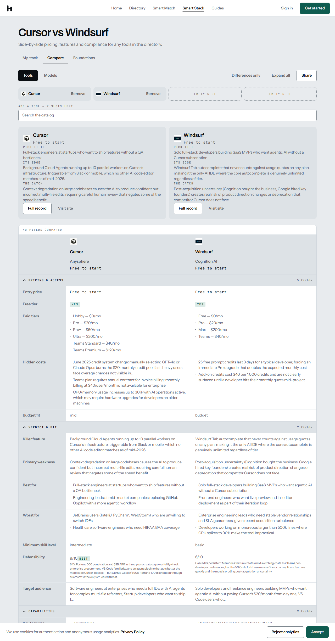 The Cursor and Windsurf grid on hokai.io, 20 August 2026. The field count is printed by the page itself.
The cell that says nothing
Scroll into Capabilities and five rows on the Windsurf side go quiet: underlying model, context window, MCP support, multimodal, agent capability. Each renders as an em dash with the words "not stated" underneath. Cursor fills all five: 200K context, MCP support YES, read-write agent capability.
Nobody guessed on Windsurf's behalf. Nothing was averaged from a competitor, and no plausible-looking figure was borrowed from a press release.
Nielsen Norman Group put its finger on why this matters in February 2024: when attribute data is missing or inconsistent across offerings, comparison tables "quickly become useless". The failure mode they describe is not the empty cell. It is the cell you cannot trust. Google's own structured-data guidance draws the line in the same place, telling publishers not to mark up information that is "not visible to the user, even if the information is accurate."
Across all 59 published comparisons there are 89 such cells, out of 4,247 values on screen. Fifteen of the 59 have none at all. When one appears, it is a fact about what a vendor has chosen to publish, and on a purchase decision that is itself worth knowing. TrustRadius, surveying B2B buyers in April 2025, found the single thing they would most like changed about vendors is the absence of transparent pricing.
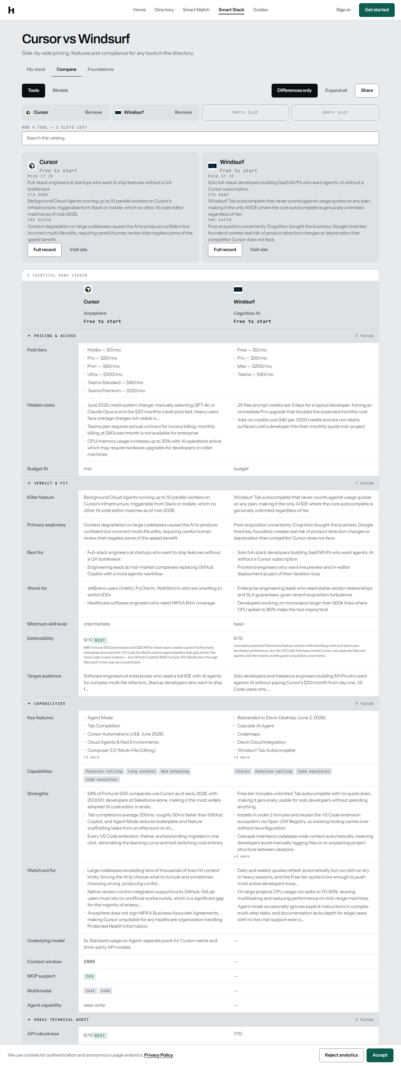 Five unfilled cells on the Windsurf side, 20 August 2026. The banner above the grid reads "5 IDENTICAL ROWS HIDDEN".
Where the badge changes sides
Models get their own schema. Claude Opus 5 against GPT-5.6 Sol prints 41 fields across eight groups, and four of them are benchmarks.
Read the four in order. AA Intelligence Index: 61 against 62, and the BEST badge sits on Sol. GPQA Diamond: 94.1% against 72.1%, badge on Opus. SWE-bench Verified: 97% against 78.5%, badge on Opus. Output speed: 54 tokens per second against 75, badge back on Sol. On price the LOWEST badges land on Opus for output ($25 against $30 per million tokens), cached input ($0.50 against $0.625) and blended cost ($10 against $11.25).
Four benchmark rows, two winners. That is what a grid can do that a paragraph cannot: it makes the split visible instead of resolving it for you. A page built to sell one of these two would not hand the rival the badge on half of them.
All four rows carry a number on both sides, which is the only way a benchmark row settles anything.
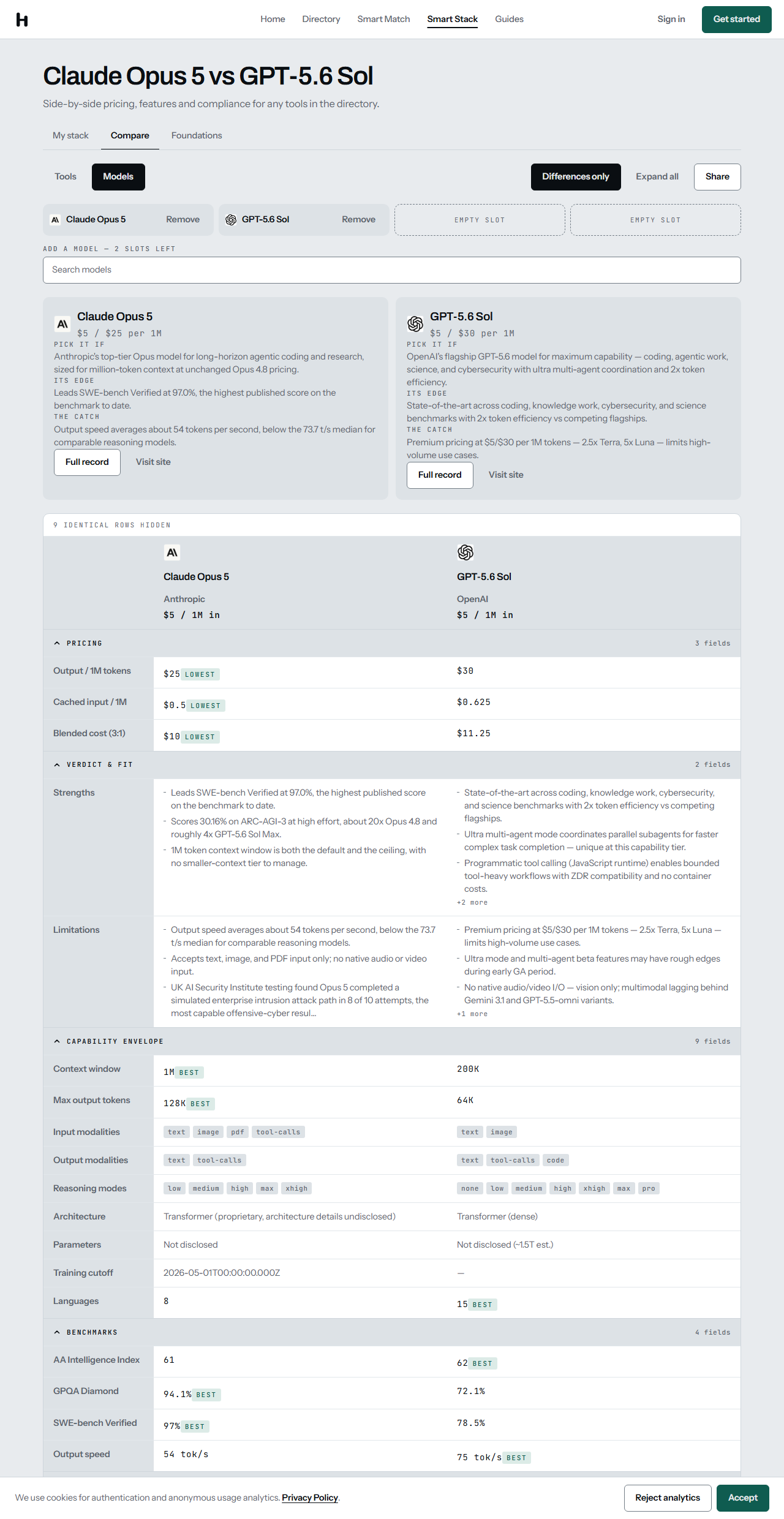 Benchmarks and pricing for Claude Opus 5 and GPT-5.6 Sol, 20 August 2026, in differences-only view.
Nine rows that agreed
Above that model grid sits a banner: 9 IDENTICAL ROWS HIDDEN. Press "Differences only" and the 41 fields collapse to 32, because nine of them held the same value on both sides. The Cursor and Windsurf grid does the same thing at a smaller scale, dropping 40 rows to 35.
The toggle writes itself into the address bar as a diff parameter, so the filtered view is the thing you paste into a thread rather than a screenshot someone has to take your word for. Nielsen Norman Group's testing found that letting people isolate differences is what keeps a long table from turning into memory work; it is also, bluntly, the fastest route from 41 rows to the three that decide it.
What all fifty-nine look like
To see whether one page is typical, we opened every comparison URL in the sitemap on 20 August 2026 and read the field count each page prints: 43 tool comparisons and 16 model comparisons, 59 in all.
The narrowest carries 28 fields, the widest 45, and the median lands on 34. Tool comparisons run leaner (median 31) than model comparisons (median 40), which is what you would expect when one schema has a benchmark section and the other has a compliance section.
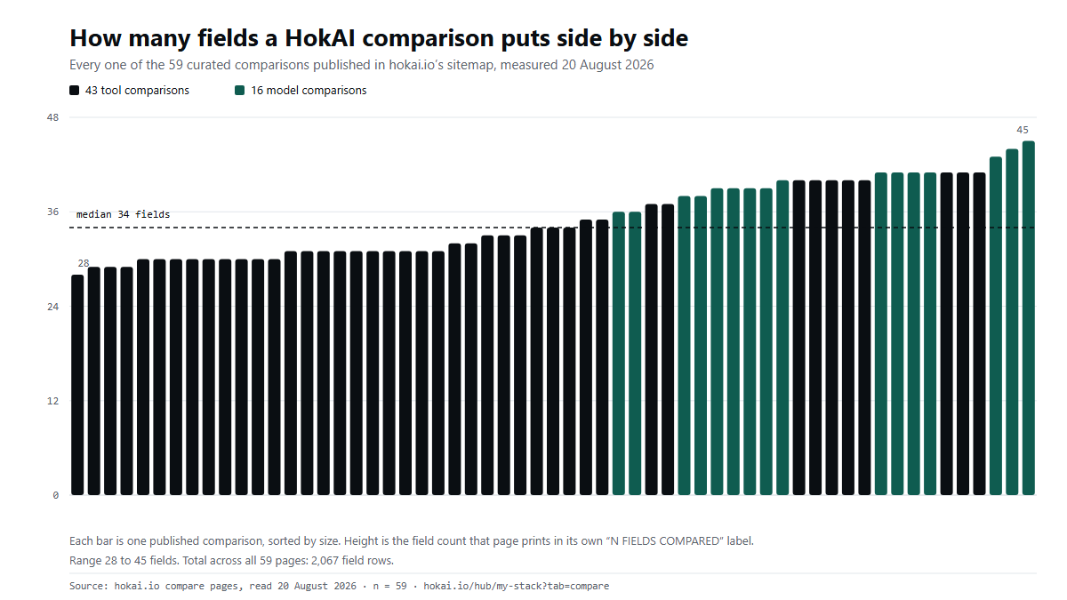 Every published comparison, measured 20 August 2026. Total across all 59 pages: 2,067 field rows.
Here is the fair objection: 40 rows is not a decision, it is homework. G2's 2026 buyer report found that evaluation is now "the longest stage" of the buying journey for 40% of buyers, and a wall of attributes is one reason why.
The grid answers that in two moves. Each item gets a short answer card (PICK IT IF, ITS EDGE, THE CATCH), which is the whole verdict in three lines, before the table starts. Then "Differences only" throws away the rows that agree. The 40 fields are there for the reader who wants to check the working, not as an obstacle course for the one who doesn't.
Every value has a record behind it
No number on a comparison originates there. Every column header carries a "Full record" link into the directory, and Cursor's record states its own last-updated date on the page: 1 July 2026 at the time of writing. That is the object the grid reads from, and the directory of 447 tools is where it lives.
The rules behind those records are published rather than implied: a flat submission fee, rankings and scores that cannot be bought at any price, daily verification of pricing and model lists, a primary source cited on every Pulse entry, and any correction stays posted where it applies for a full month. We have written up how a listing is verified before it goes live and what happened when we opened every source link we cite.
This matters more than it did two years ago. TrustRadius found 90% of buyers click through the sources cited in AI Overviews to check them, and G2 puts review sites (38%) and AI chatbots (37%) at the top of what shapes a shortlist. A comparison that cannot survive being clicked through is not worth publishing.
Who the compare grid isn't for
It is built for a shortlist you already have. Four slots, by design. Nielsen Norman Group's guidance is that comparison tables work while the alternatives stay few, and beyond about five the format stops helping. If you are trying to survey a category rather than settle one, this is the wrong door.
It is also curated rather than exhaustive. 59 head-to-heads are published against a directory of 674 entries; the permutations of 447 tools would run to five figures, and most of them would compare things nobody weighs against each other. Readers who have not formed a shortlist yet are better served by Smart Match, which is free, needs no account to start, and reaches a ranked shortlist in about five turns of conversation, or by browsing the directory by use case.
And it will not hand you a single winner. On four benchmarks the badge changed sides twice. If what you want is one ranked list with one tool at the top, the grid will frustrate you, and that is the trade we made on purpose.
What would change this
An instrument is only as good as its worst page. If the field counts drifted down, if unfilled cells climbed past a couple of percent, or if the badges started landing on the same side every time, the grid would have quietly become a sales sheet in a table's clothing.
All three are checkable by anyone. The 59 URLs are in the sitemap, and each page prints its own field count. We ran that check today. Run it again in a month. We publish what we are, and this is the kind of claim that should not need taking on trust.
Frequently asked questions
How many fields does a HokAI comparison put side by side?
It depends on the pair, and each page prints its own count. Measured on 20 August 2026, the 59 published comparisons ranged from 28 fields to 45, with a median of 34 and 2,067 field rows in total. Model comparisons run wider than tool comparisons because they carry a benchmark section.
Which is better, Cursor or Windsurf?
Neither answer is honest without a use case, which is why the grid does not pick one. On 20 August 2026 both listed the same $0 entry and the same $20/mo first paid tier, and Cursor filled five capability rows that Windsurf had not published. Read the differences-only view and decide against your own constraints.
What happens when a vendor has not published a spec?
The cell reads not stated. Nothing is estimated, averaged from a rival, or inferred from a press release. Across all 59 comparisons that applied to 89 cells out of 4,247 values on screen, and 15 comparisons had none at all.
Where do the numbers in a HokAI comparison come from?
From the directory record behind each column, which every comparison links to as Full record. Those records carry their own last-updated date on the page. Rankings and scores cannot be bought at any price, and a correction remains posted where it applies for thirty days.
Can I see only the rows where two tools differ?
Yes. The Differences only control hides every row that holds the same value on both sides, and the state travels in the URL, so the filtered view can be shared. Claude Opus 5 against GPT-5.6 Sol drops from 41 fields to 32 that way; Cursor against Windsurf drops from 40 to 35.
Covered in this guide
- we publish what we are: HokAI is an editor-curated, AI-only directory at hokai.io. Listing requires a flat submission fee; rankings cannot be bought. Every Pulse update is verified against a primary source.
- Claude Opus 5: Anthropic's July 2026 flagship LLM, with a 1M token context window by default and a new xhigh reasoning-effort mode for long agentic runs.
- Cursor: Cursor is an AI code editor built on VS Code, widely adopted across large enterprise engineering teams, with Agent Mode, Tab completion, and Cloud Agents.
- GPT-5.6 Sol: GPT-5.6 Sol by OpenAI (July 2026): flagship-tier pricing, 2x token efficiency vs peers, ultra multi-agent coordination, programmatic tool calling. Microsoft 365 Copilot preferred model.
- Windsurf: Windsurf, now Devin Desktop from Cognition, is a VS Code-based editor with local and cloud agents, free with unlimited Tab and Pro at $20 a month.
Sources
Still deciding?
This guide covers a handful of options. Smart Match checks every listing in the directory against how you actually work and what you can spend, then hands you the shortlist and the reason behind each pick.
Start Smart MatchRelated guides
- 41 of 100 HokAI Guides Carry a Screenshot. All 106 Still Load.Inside HokAIHow the directory works, verified in the open
- What Happened When 7 AI Agents Got Real Bank Accounts and No SupervisionAnalysisWhat changed and who it affects
- AI Development Services in 2026: Which Layer You Actually NeedBuyer's guideHow to pick, across a category
- Best AI Chatbots in 2026: Pick by the Job, Not the LeaderboardUpdatedRechecked against current sources
- Best AI Coding Assistants in 2026: Pick the Job, Not the BrandBuyer's guideHow to pick, across a category
- Best AI for Writing a Business Plan in 2026: Tested Picks and a VerdictBuyer's guideHow to pick, across a category